Redesigning the Product Detail Page (PDP)
A mobile-first redesign that delivered a 24% uplift in conversion and reduced bounce rates by 12%

Role
Senior UX Manager & Designer
Industry
E-Commerce
Year
2025
Skills & Methods
Usability Research · A/B Testing · Behavioural Analysis · Content Strategy · Conversion Optimisation
Key results
+23.7%
Conversion increase (mobile)
-11.9%
Bounce rate reduction (mobile
+21%
Checkout conversion uplift from PDP
Overview
The Product Detail Page is where intent becomes action - the moment a customer decides whether to add to bag or walk away. At Seasalt, the signals were clear: it wasn't performing as well as it should. High bounce rates, low scroll engagement, and users regularly missing content that mattered - reviews, recommendations, imagery - because the page was too long and the hierarchy wasn't earning their attention.
The redesign delivered better quality traffic, higher revenue, and deeper engagement - even against a backdrop of reduced overall session volumes.
Why this project needed a reset
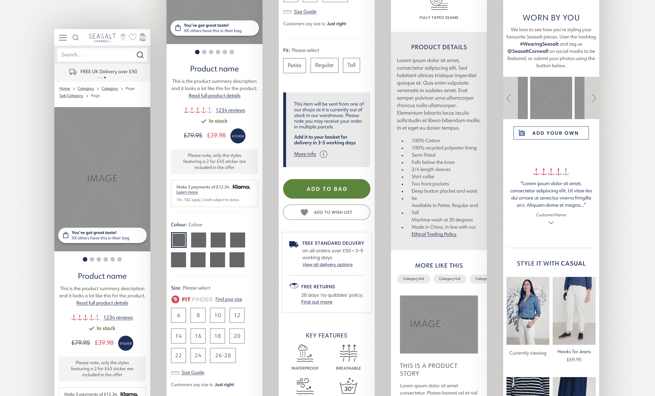
I joined after initial research and early designs had already been completed. It quickly became clear the proposed designs hadn't accounted for the full PDP experience - they hadn't been tested across product types, content variations, or device breakpoints.
Rather than iterate on an incomplete foundation, I reset the design direction, rebuilt the approach from the research up, and led it through to launch.
This wasn't a clean-room project. Short development window, constrained frontend resource, and a lead developer handover mid-QA. Delivering strong work under real pressure was as much part of the brief as the design itself.
What I led: | Team contributions: |
|---|---|
End-to-end design strategy and direction | UX team: image gallery design, content, QA rounds |
Size guide redesign and PDP integration | Digital Product Owner: 3-month analytics review |
Gift Card PDP redesign | Trade: recommendation zone strategy |
Dev handoff, QA, and launch | Creative: brand alignment and imagery |
Two design approaches across all devices and product types | Frontend development: build and implementation |
Research & Discovery
A three-month review was conducted by the UX team and Digital Product Owner using Contentsquare, session replay tools, and competitor analysis - supplemented by findings from a recent usability study. The picture was consistent: the page was doing too much, in the wrong order, for too little payoff.
Insight | Detail |
|---|---|
Recommendation behaviour | Transacting users viewed significantly more PDPs than non-transactors — pointing directly to the commercial value of product recommendations and easy exploration between pages. |
Wasted page real estate | High-exposure, low-engagement elements — breadcrumbs, a duplicate delivery section — consumed space without contributing to conversion. Content hierarchy wasn't working. |
Reviews were undervalued | Despite low scroll exposure, product reviews showed a strong correlation with revenue. Surfacing them more prominently should drive purchases. |
Scroll depth too low | The page was too long. Users regularly missed high-value content — reviews, recommendations, UGC — simply because it was below where they stopped scrolling. |
Imagery drives decisions | Product imagery was the primary engagement driver. Users navigated to it first, used colour swatches to explore variations, and made purchase decisions based on what they could see. |
Usability study corroboration | Study participants consistently reinforced the need for clear imagery, accessible sizing tools, and shorter pages. The second delivery section was flagged as redundant across multiple sessions. |
Define
With a clear research base, we defined design objectives to guide every decision - from layout structure to content hierarchy. These weren't aspirational statements; they were directly grounded in what the data showed us.
Theme | Description |
|---|---|
Mobile first | Prioritise the mobile Add to Bag experience. The majority of Seasalt's traffic is mobile — the design had to work there first. |
Content reduction | Remove redundant content. Cut the second delivery section - near-zero engagement. Surface reviews and UGC using the space recovered. |
Imagery & UGC | Make product imagery immediately accessible. Expose the gallery earlier, surface UGC, and reduce clicks needed to browse image sets. |
Performance | Replace Fotorama with Cloudinary to improve load times and Core Web Vitals. Technical performance is part of the user experience. |
Brand alignment | Every element — typography, colour, CTAs, tone - to reflect Seasalt's updated brand direction: clean, modern, purposeful. |
Recommendations | Increase recommendation visibility to replicate the browsing behaviour seen in converting customers. Minimum of two zones per PDP. |
Design Strategy
With limited time and stakeholder bandwidth, I developed two distinct design directions and applied each across a range of product types, image counts, and content lengths — to stress-test both in realistic conditions, not idealised mockups.
APPROACH 1 - Minimal Update
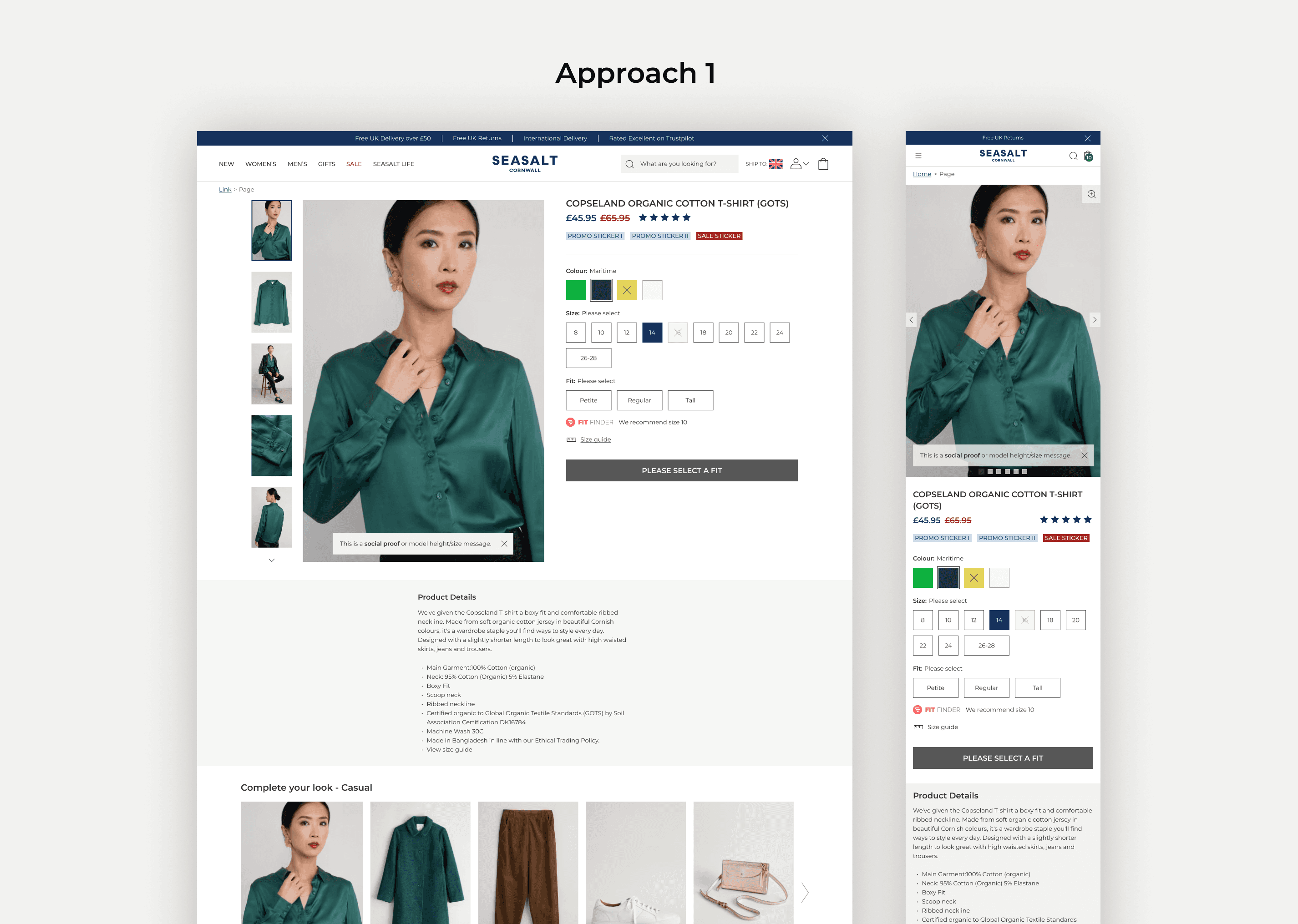
A visually refreshed version of the existing layout.
Lower risk, quicker to implement but limited in its ability to solve the structural and hierarchy problems the research had identified. It would have looked better without working much better.
✓ SELECTED - APPROACH 2 - Template Redesign
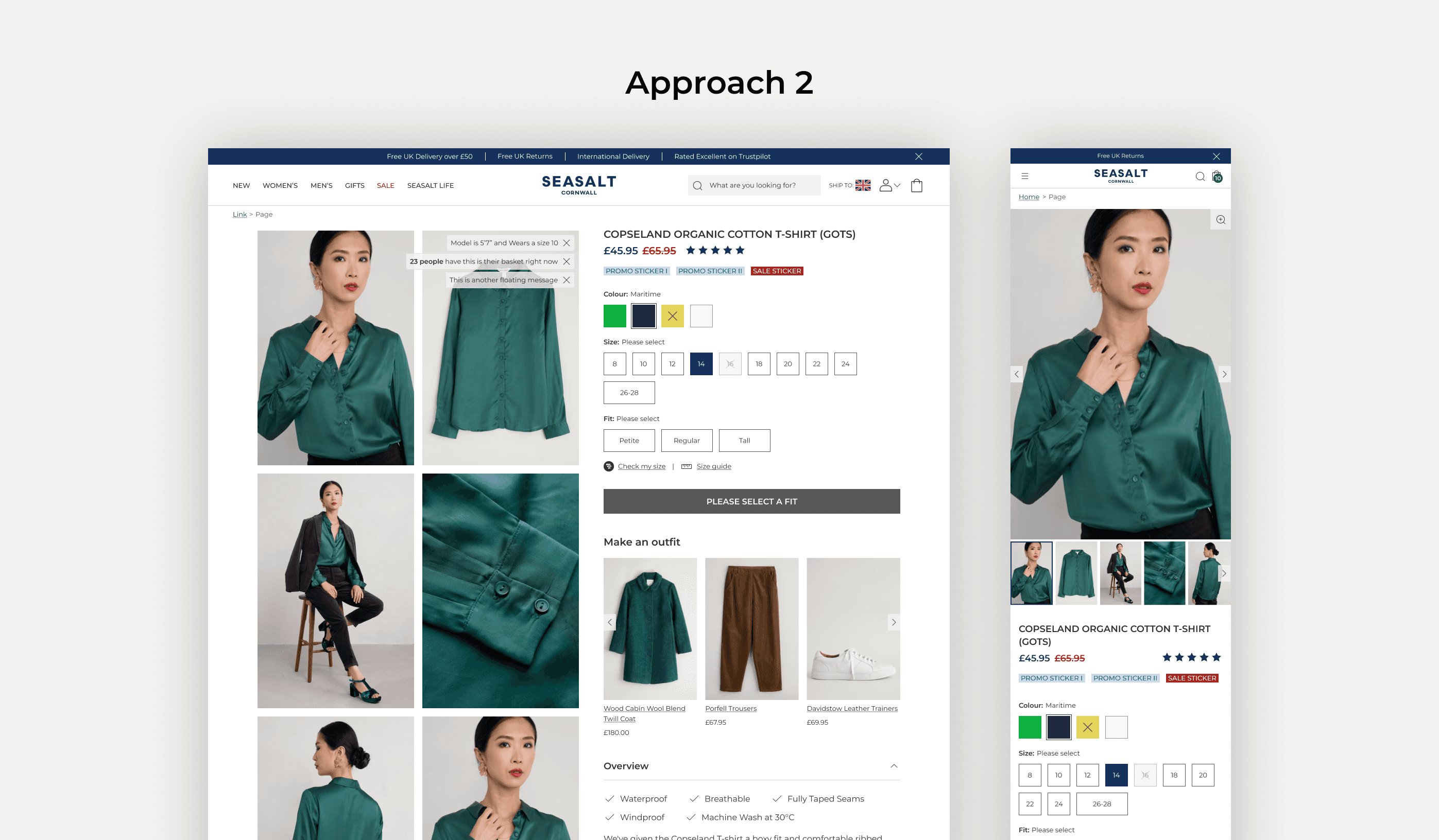
A full layout and template overhaul.
Higher risk, significantly more impactful. This approach directly addressed hierarchy, mobile-first structure, recommendation visibility, and visual clarity in a way the minimal update couldn't.
We presented both to cross-functional stakeholders: Trade, Product, Creative and then to senior decision-makers.
Approach 2 was unanimously selected. The research gave stakeholders confidence to back the bolder choice.
Iterations & stakeholder review
Designs were reviewed within the UX team first, then shared with Graphic Design, Trade, and developers to get early input on feasibility and brand alignment. By the time we reached senior stakeholder review, the design had already absorbed meaningful feedback — minimal changes at that stage, fast sign-off.
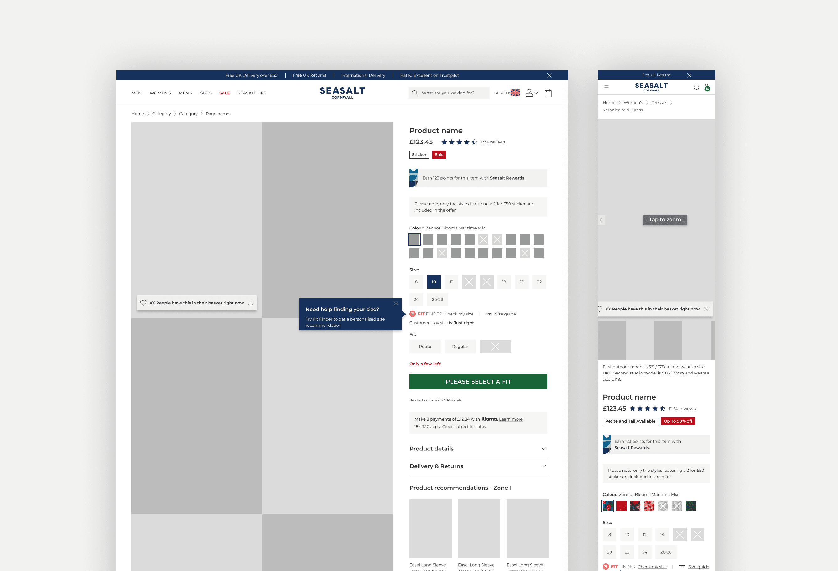
Key Design Decisions
Every decision maps back to a research finding.
Decision | Description |
|---|---|
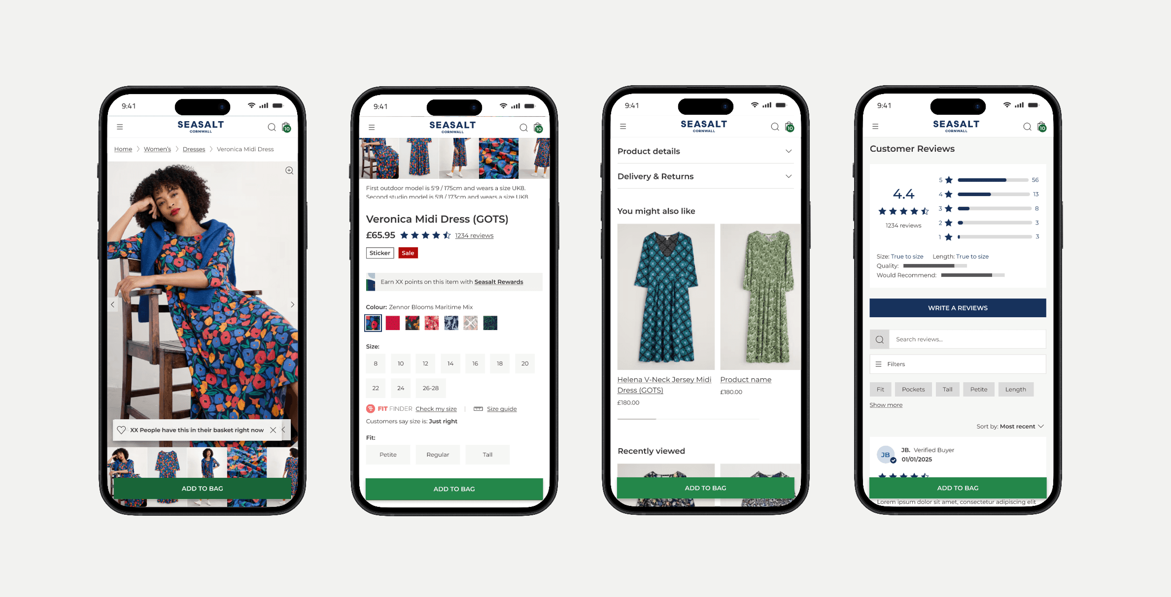
Exposed image gallery | Desktop: full gallery in a two-column grid, visible on load. Mobile: thumbnail strip beneath the hero image, letting users jump to close-up or feature shots without extra taps. Fewer clicks, faster confidence in the product. |
Sticky Add to Bag bar | Pinned to the bottom of the browser on mobile. On desktop and tablet, the bar uses available white space to surface selected options and product information — keeping the primary action always accessible. A/B testing confirmed increased CTA engagement after repositioning. Changing the button label from "Back to details" to "Add to bag" had a measurable impact on engagement. |
Accordion layout | Collapsible sections for product details, delivery info, and product stories reduced total page height significantly — meaning users actually reached recommendations and reviews. No usability issues flagged with the accordion pattern in post-launch studies. |
Content reduction | Delivery and returns condensed to essentials, with deeper information linked to supporting pages. The second delivery section — near-zero engagement in analytics — cut entirely. Space redistributed to higher-value content. |
Size guide integration | The size guide is dynamic — product-specific measurements, fit options, and sizes — but supporting content below it was generic across all categories. I embedded the main size guide content inline so users could access sizing guidance without leaving the PDP. I also redesigned the standalone size guide page to keep both surfaces consistent. |
Product recommendations | Redesigned for visual prominence. Minimum two recommendation zones per PDP. Desktop sidebar used for additional recommendations. Guidance provided to Trade on zone strategy — including how to better use promotional and multibuy offer spaces. |
Reviews & UGC | Reviews surfaced more prominently given strong revenue correlation in the research. Custom questions added to improve review content quality. UGC added to the page template — rollout builds gradually as more products accumulate customer imagery. |
Visual UI refresh | Typography, colours, and spacing fully updated to Seasalt's new brand guidelines. Reduced colour palette, cleaner layout, more modern aesthetic. Redesigned UI tables, updated CTAs, new key feature icon treatment, and product story modules added. |
Gift Cards
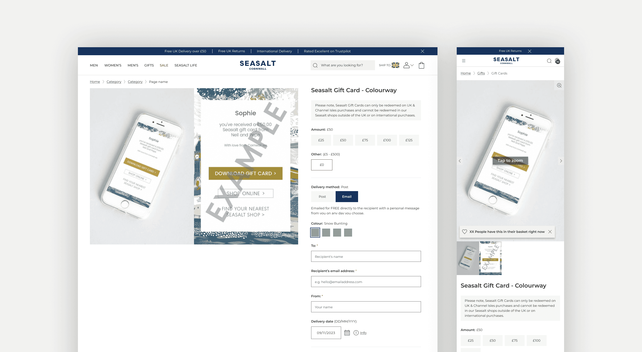
The Gift Card PDP, running on its own template and user flows, also received dedicated attention as part of the wider project.
Having previously optimised this page, I was able to build on and refine past decisions efficiently without starting from scratch.
Key improvements:
Simplified form structure
Clearer delivery method messaging (email vs. post)
Predefined gift message options to reduce input effort
Improved character limit guidance given constraints from the external delivery provider.
Testing & Validation
A/B testing
We ran A/B tests on specific features during rollout. The most significant tested positioning of the sticky Add to Bag button, resulting in higher conversion and increased CTA engagement.
Changing the button label from "Back to details" to "Add to bag" - making the action unambiguous - had a measurable commercial impact.
Usability testing
We have since run two usability studies that included PDP and product evaluation tasks. Users engaged with product imagery naturally, navigated to product details without friction, and showed no issues with the accordion pattern.
Challenges & Constraints
Good work happens inside real constraints. These were ours:
Developer handover mid-QA | The lead developer went on annual leave midway through QA. The project transitioned to a new frontend developer. A thorough handoff and close collaboration maintained quality and momentum without slipping timelines.
Third-party tool limits | The reviews widget and image gallery components limited what was achievable in design and UX. Product recommendations couldn't be fully optimised due to third-party customisation constraints. We documented the ideal state clearly so future iterations have a defined target.
UGC coverage gap | Only a small proportion of products currently have customer imagery. The template is built and ready — it's a content gap, not a design limitation.
Accessibility | Layouts tested across devices and breakpoints. Accessibility reviewed during QA. Some limitations remain due to third-party tooling — improved alt text support for imagery is a documented next step. The Gift Card PDP also received attention as part of this project — building on past optimisation work efficiently.
Results
Despite a decrease in overall site traffic during the period, the redesign delivered higher-quality sessions - users who found a product, engaged with it, and converted. The numbers confirmed what the research predicted.
+23.7% Mobile conversion increase
+16.6% overall PDP conversion improvement, year on year
+21% Checkout conversion uplift from PDP
−11.9% Bounce rate reduction on mobile
↑ Scroll - Improved scroll depth: users now reaching recommendations and reviews
Users spent longer on site and explored more pages per session - a direct signal that the recommendation redesign was working. Mobile was the standout performance story; desktop remained the stronger channel for cart value and overall bounce rate.
"I just want to say a big well done and thank you to you all for getting the new PDP redesign over the line. It looks fantastic — clean, modern, impactful and user-friendly."
- Chief Customer Officer, Seasalt Cornwall
View more work
E-Commerce | UX Design | User Research | Prototyping | Strategy
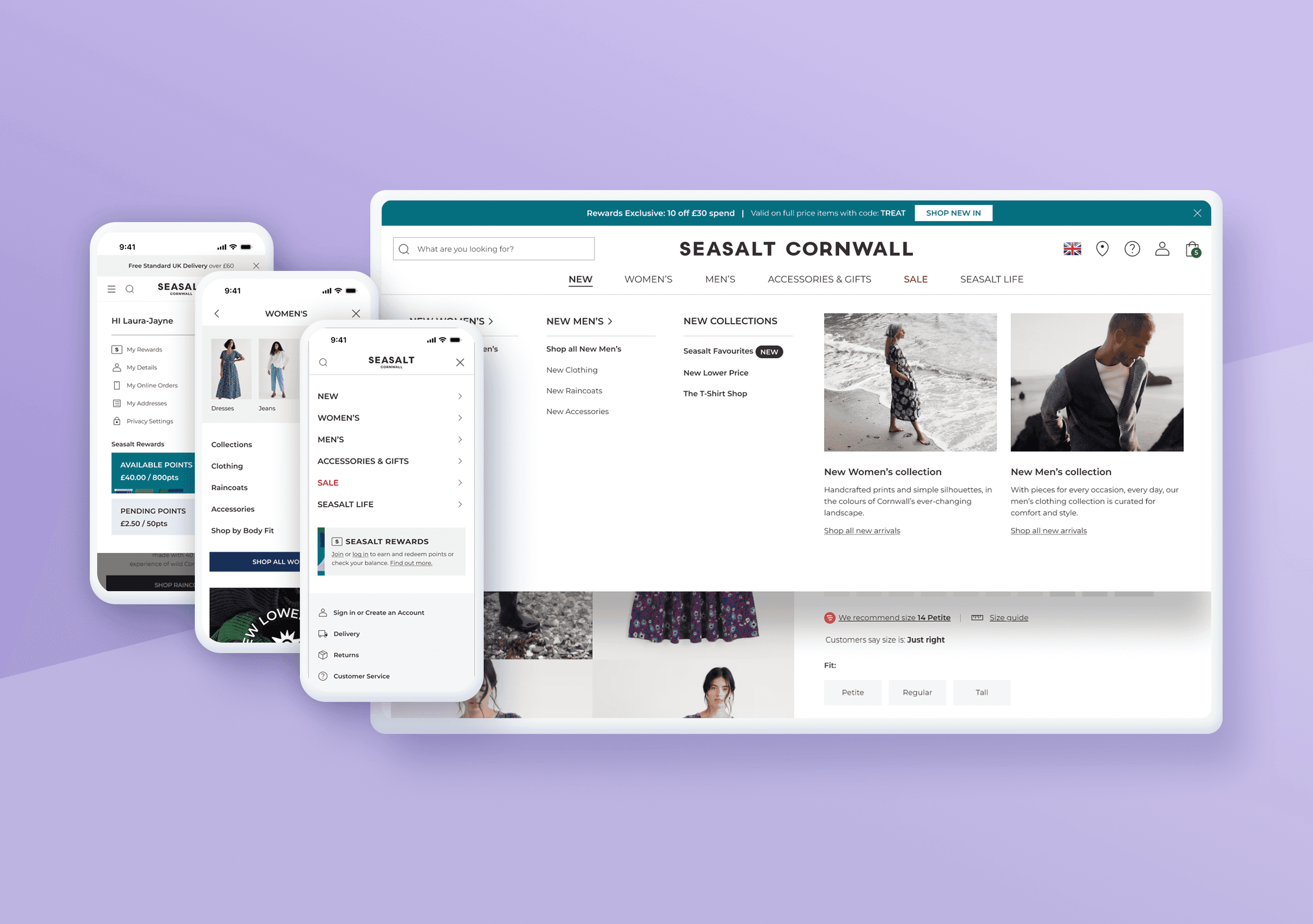
Redesigning Seasalt's Header & Menu
A research-led header and navigation redesign, validated with an A/B test before launch — grew mobile search engagement by 51% and desktop account engagement by 60%
Community | UX | Information Architecture | User Research | Strategy
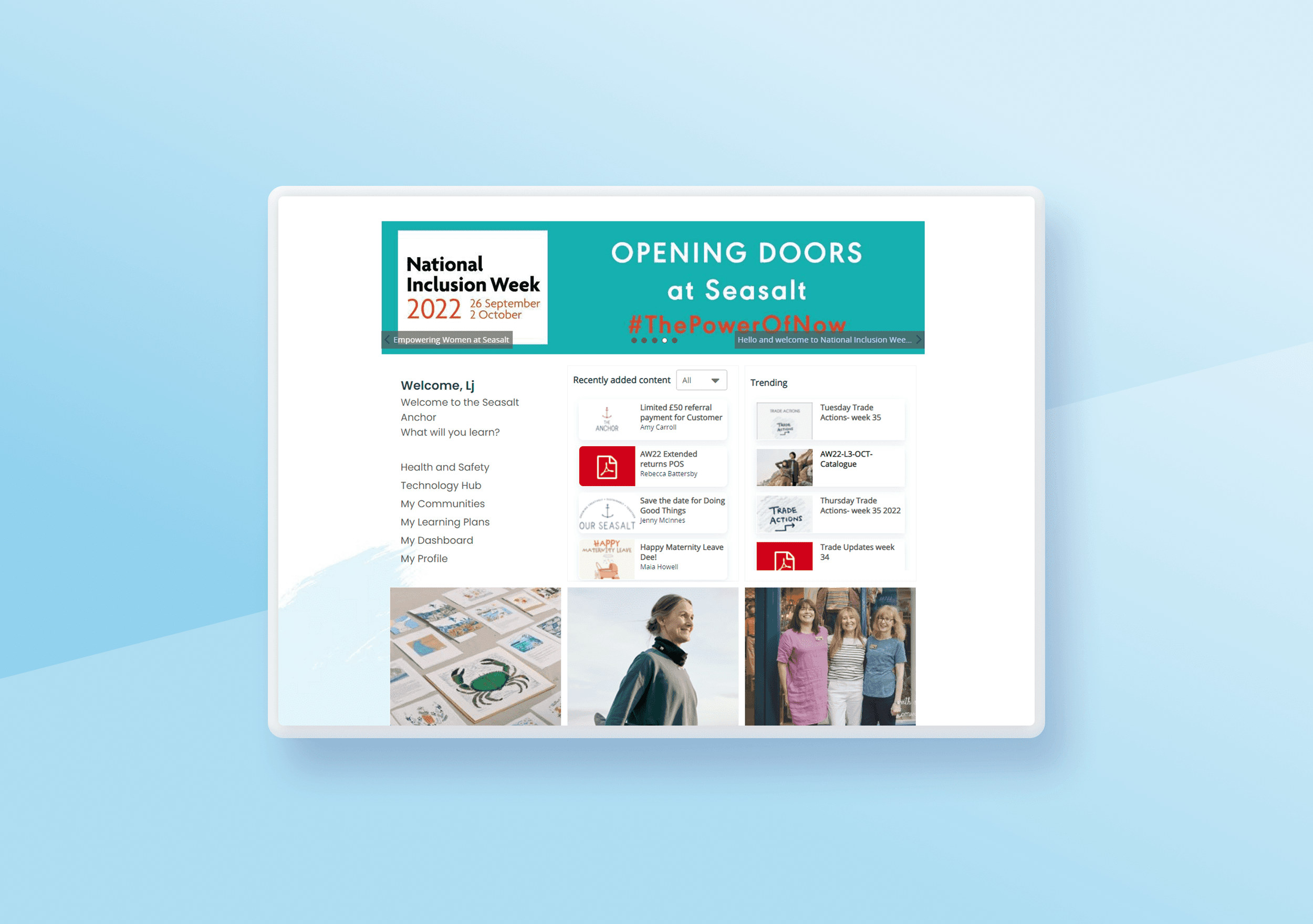
Transforming Fuse: A UX Optimisation of Seasalt’s Intranet
Improving usability and brand alignment to enhance the employee experience and drive engagement.
E-Commerce | UX Design | User Research | Prototyping | Strategy
Optimising Seasalt’s Navigation & IA
Revamping user experience through improved navigation and usability and driving 18% increase in page views to key product categories
Load More