Redesigning Seasalt's Header & Menu
A research-led header and navigation redesign, validated with an A/B test before launch — grew mobile search engagement by 51% and desktop account engagement by 60%
Role
Senior UX Manager & Lead Designer
Industry
E-Commerce
Year
2026
Skills & Methods
Usability Testing · A/B Testing · Behavioural Analysis · Mobile-First Design · Stakeholder Management
Key results
51×
Find a Shop clicks vs. the old buried link
+29%
Need Help engagement
+3.5×
Mobile menu conversion per click
Overview
The header is the first thing every customer sees, and the tool they rely on to find everything else on the site. When a later version, built without UX involvement, stripped out functionality the business needed and introduced new usability problems, I came back, diagnosed what had gone wrong from the data, and rebuilt the header and navigation from the ground up.
The pattern across the results is consistent: interactions that previously went nowhere started converting, and features that had been effectively invisible started getting found. Six weeks post-release:
Mobile menu conversion rate per click nearly quadrupled post-release
Desktop bag conversion rate rose by close to nine percentage points
Find a Shop engagement up 51x on the old, buried link
Need Help engagement up 29%
Desktop account conversion rate per click more than doubled
Menu users spend almost 3x longer on site and view 3x more pages than average
The Problem
This is my second navigation redesign at Seasalt. The first was in 2023, when I led a research-led overhaul of the navigation architecture - tree testing, Contentsquare analysis, usability testing, and a full structural rethink that delivered an 18% increase in category page views. (View previous redesign)
While I was on maternity leave, a further version was released. It was driven by the graphics team rather than UX and, while it introduced some visual updates, it created new usability problems and left the header without functionality the business needed.
This project was the fix. I came back, diagnosed what had gone wrong using Contentsquare data, validated those findings through A/B testing and usability testing with real customers, and designed a significantly improved header and navigation from the ground up.
Key issues
The header was redesigned during the 2024 brand refresh, but that work focused on visual branding rather than user experience. Several validated features were removed or consolidated, including some already evidenced by earlier research and A/B testing.
I conducted a full UX review across desktop, tablet and mobile for both the header and menu.
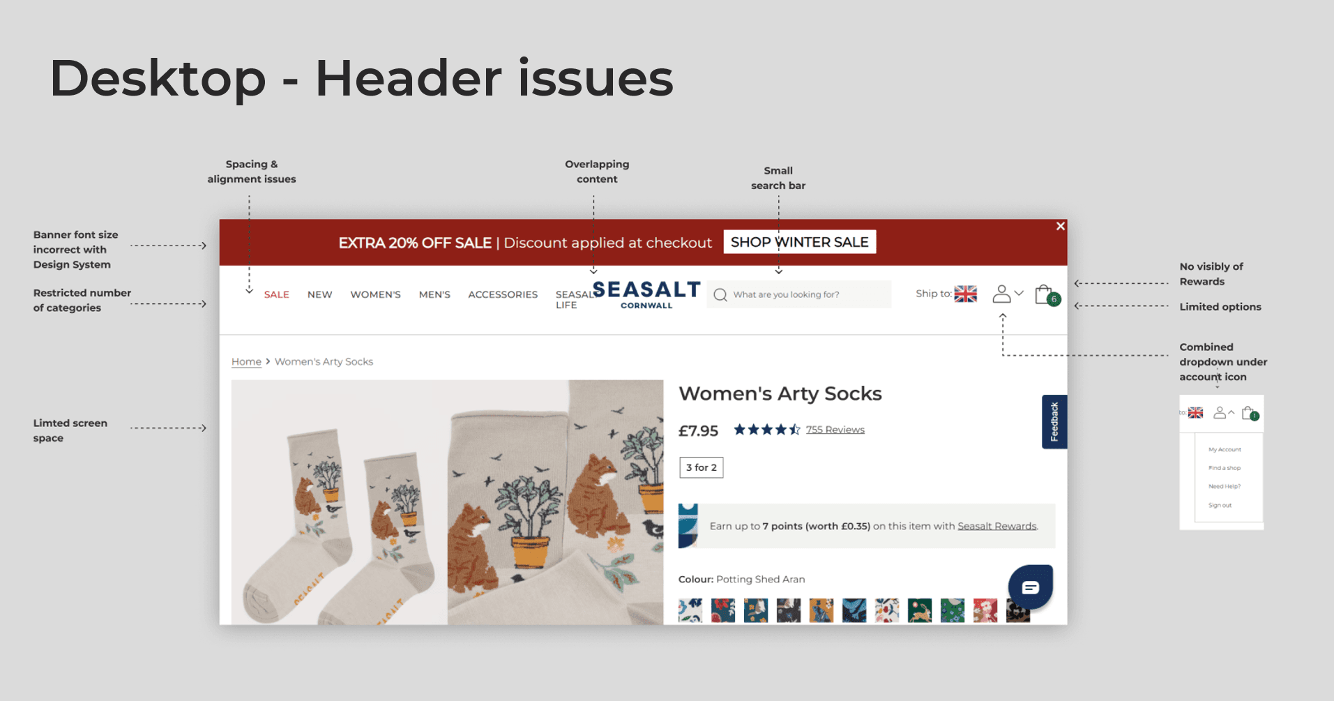
Header issues:
No ability to log in or create an account from the header
No Find a Shop or Need Help shortcuts
Search was small and separate from navigation elements on mobile
No Seasalt Rewards visibility
Adding any new menu link broke the layout
No ability to show multiple banner messages
Inconsistent spacing, poor visual hierarchy, contrast issues, limited dropdown space, misaligned mega menu layouts
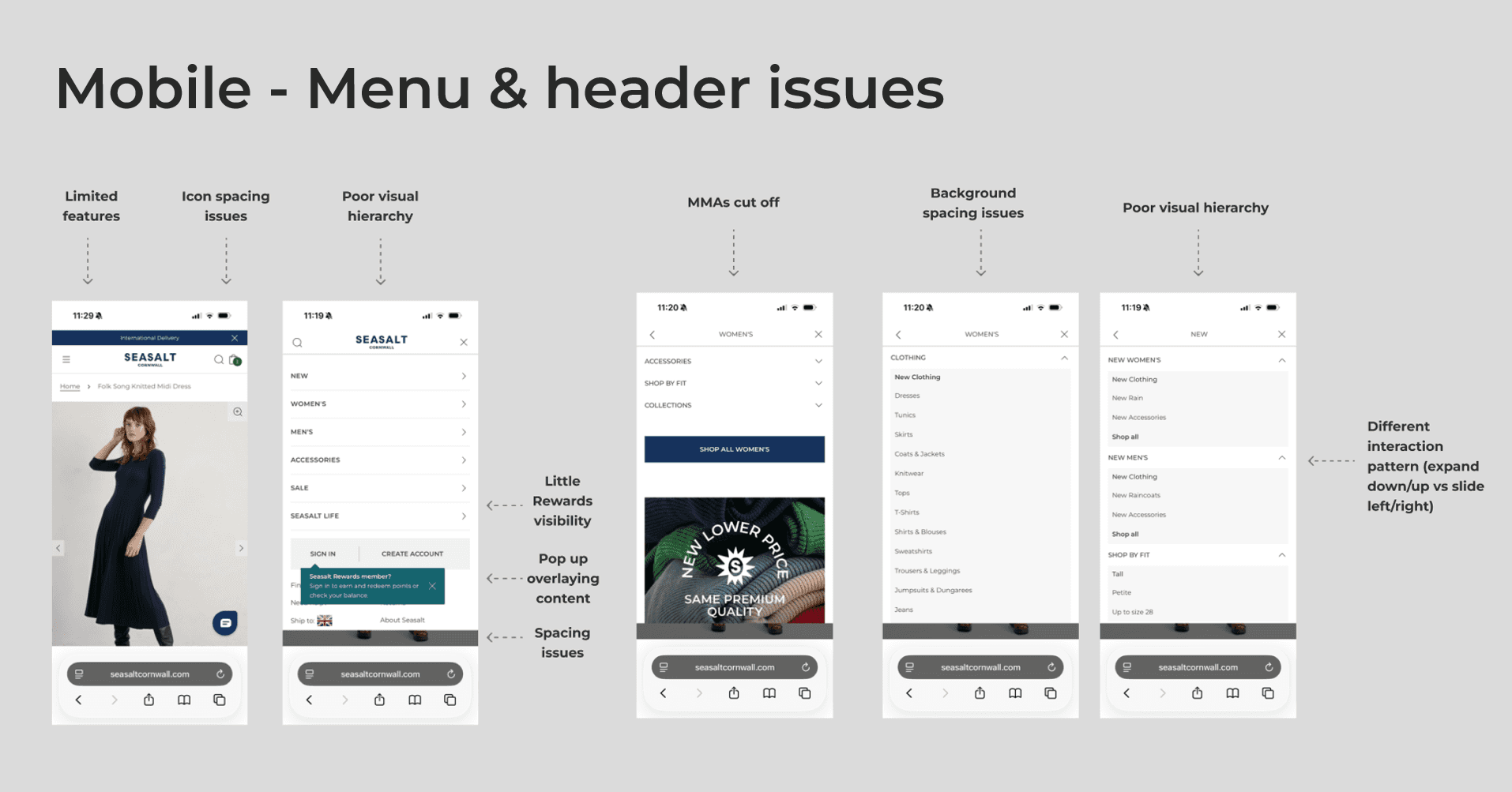
Menu issues:
Mobile menu underperforming — structure, interaction, and speed
High-demand categories not prominent enough
Limited visual elements — no imagery, no category thumbnails
Mega menu ads (MMAs) inflexible — limited ability to customise content
Menu structure had inconsistencies and redundant categories

Research & Discovery
Contentsquare behavioural analysis
I analysed engagement across desktop and mobile, looking at click rates, tap rates, zone engagement, and session behaviour, ahead of any design work.
Key findings:
Menu users are high-value users
Users who engaged with the menu spent nearly 3x longer on site, viewed almost 3x more pages per session, and bounced far less. The commercial case for improving the menu wasn't just about usability — it was about converting more users into high-engagement behaviour the data already showed existed.
Mobile was underperforming relative to desktop.
Mobile users who interacted with the menu showed strong relative engagement, but the baseline mobile experience overall performed significantly worse than desktop: shorter sessions, fewer pages, higher bounce. A clear opportunity to close that gap.
The highest engagement was with Sale and New Arrivals - the most common next step after any category page was a PDP. Users were primarily using the menu to discover what's new or on sale, not to browse broadly.
Pre-launch A/B test — mobile header icons
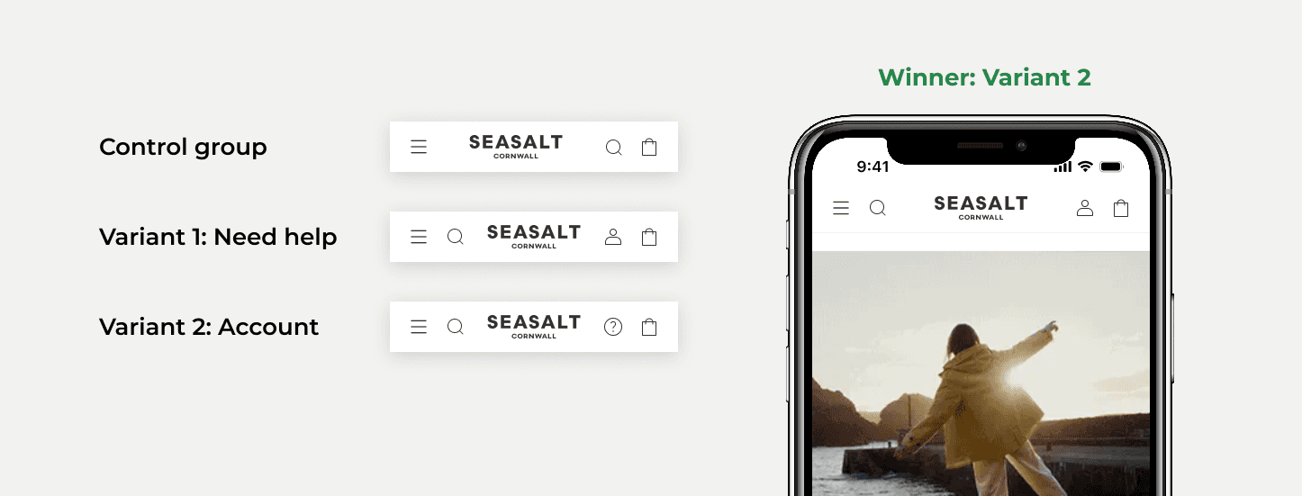
Before the full redesign launched, I ran an A/B test to validate one of the key header changes: which icon and position worked best on mobile. A control group and two variants — Need Help icon vs Account icon, both with search on the left.
The account-icon variant won clearly: 24.06% click-through rate, 8.96% conversion rate and drove nearly £3K in attributed revenue.
This finding directly informed the final design: account icon in, search repositioned next to the menu.
Usability testing - desktop and mobile concepts
I ran a usability study evaluating two proposed header and navigation concepts before development: 10 mobile participants across two rounds and 5 desktop participants.
Participants explored headers, promotional messaging, account access, and menu structures.
Concept 1: Kept things minimal: a single simple banner, subcategories split into their own dedicated screens, Dresses and Knitwear separated out from Clothing, and a back button paired with search for getting around.
Quick links sat in a grid, with content tailored to each subcategory.Concept 2: Denser and more promotional: two separate banner zones each with their own style, subcategories kept together in one list rather than split apart, and quick links stacked vertically instead of gridded. Navigation used a back icon plus a single list of all categories, rather than Concept 1's split-screen approach.


Key findings:
Mobile - Concept 1's navigation was generally preferred; Concept 2's image-led navigation and reduced clicks were liked, but many found it overwhelming due to long lists and information density
Mobile - Concept 2's header significantly outperformed Concept 1 - the red sale banner and rotating USP content consistently attracted attention and communicated value more effectively
Dresses and Knitwear being segmented separately in Women's created confusion - users didn't understand why Dresses existed both inside Clothing and as a standalone category
"Collections" lacked meaning; even existing Seasalt customers questioned it and would ignore the category
Header utility icons were mostly understood - Account, Search, and Basket tested strongly, with some confusion around Find a Shop, Need Help, and the global shipping/country selector
The testing comparison between the two concepts was as valuable as any single finding - understanding why each worked meant the final design could combine Concept 1's cleaner navigation structure with Concept 2's more engaging header approach, rather than simply picking a winner.
What the Research Shaped
Finding | Decision |
|---|---|
Collections consistently confused users | Renamed and restructured; no standalone 'Collections' category |
Dresses/Knitwear split-out felt odd | Removed as separate top-level items; users filter within categories instead. Account icon strongly outperformed |
Help icon | Account icon confirmed in mobile header, search repositioned left |
Concept 1 menu structure preferred, Concept 2 header preferred | Combined the clearer menu structure with the more attention-grabbing header pattern |
Header lacked room to grow | Menu moved to its own row, freeing the header to add Find a Shop, Need Help, and Account |
Designs
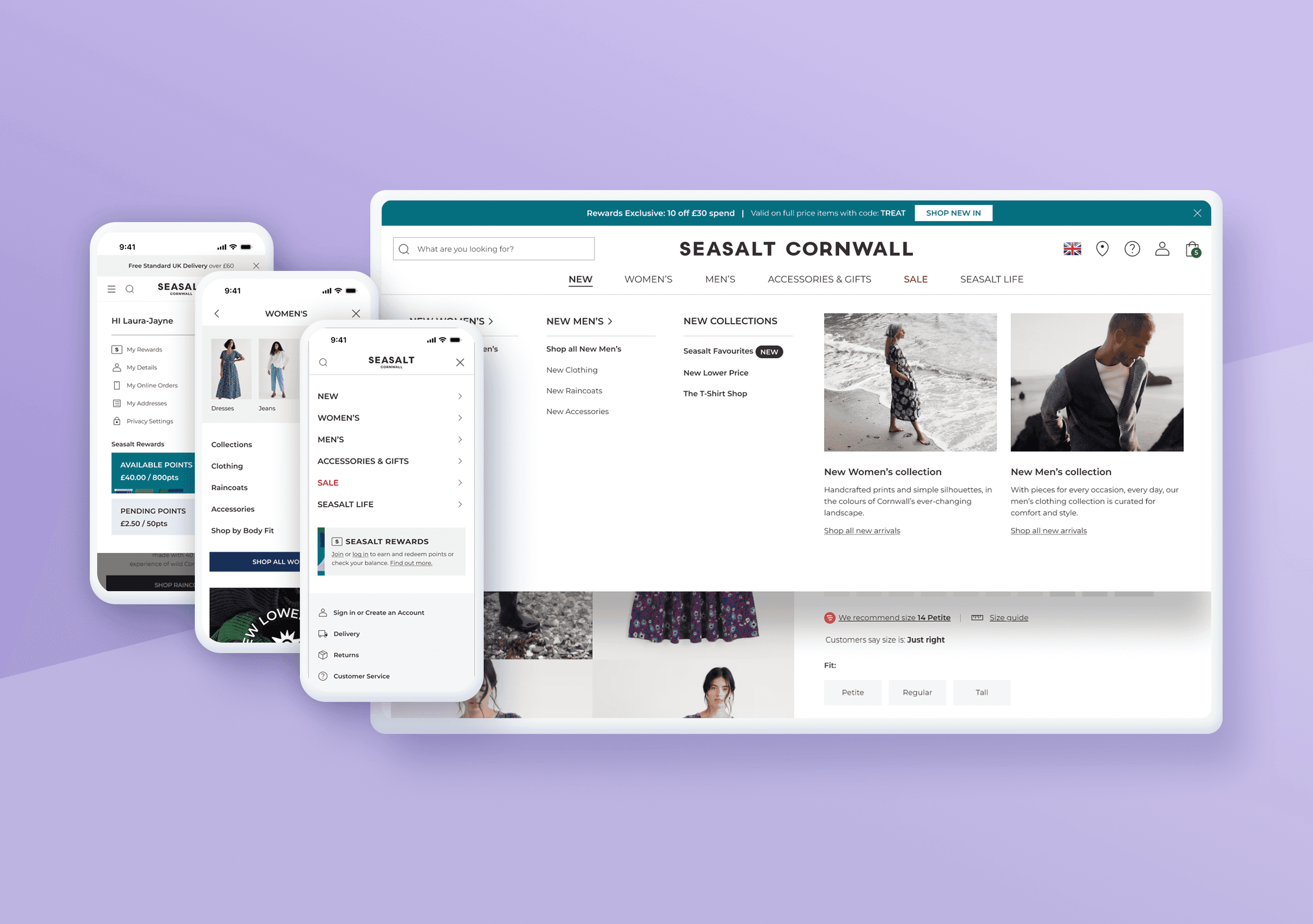
Header & Menu - desktop & tablet
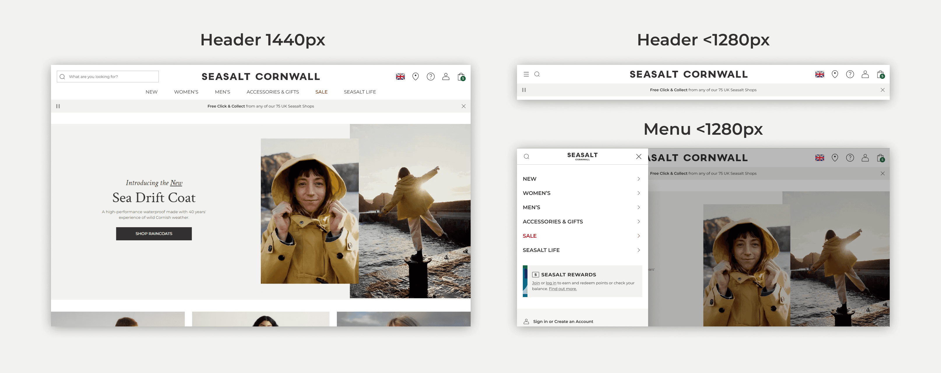
The menu was moved to its own row - solving the layout constraint that had prevented adding new links, and giving the header room to scale.
Search bar repositioned left and made slightly larger
Additional icons added: Find a Shop, Need Help, each opening a dropdown
Redesigned My Account dropdown — login, account creation, Rewards visibility, personalised content when logged in
Header animates away on scroll down, reappears on scroll up, maximising screen area
New banner message zones include an animating USP banner
On smaller desktop widths (1280–1440px) the layout falls back to a menu icon that opens the tablet/mobile menu
Header - mobile
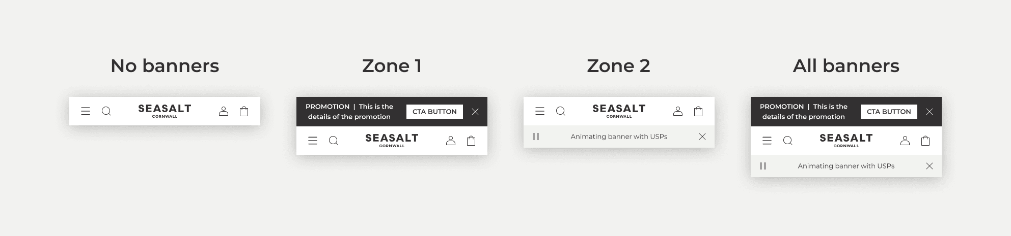
New animating banner zone with pause and close controls
Account icon added next to the mini bag, opening the account dropdown
Search repositioned next to the menu, grouped with the other navigation icons
Increased spacing between icons for usability
Header - new dropdown menus

Find a shop & need help
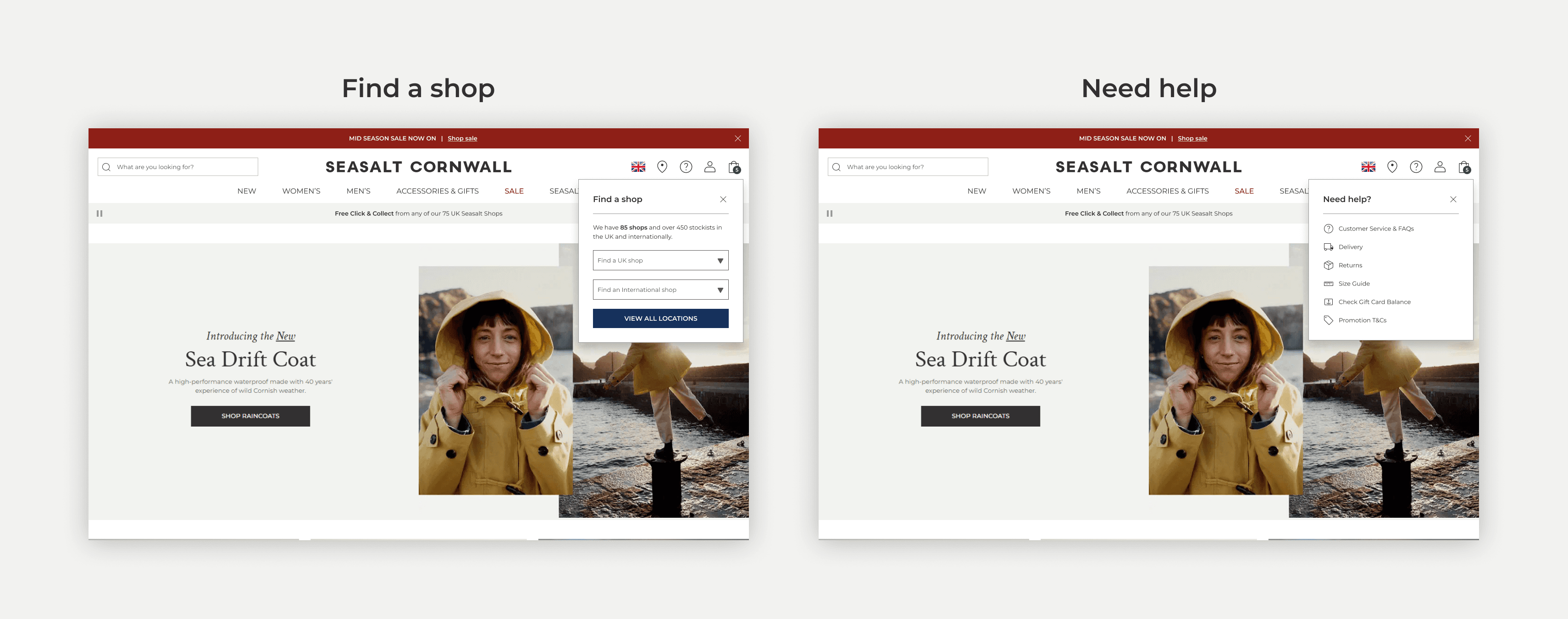
Find a Shop and Need Help icons both existed in the header before the previous (2024) redesign removed them. The new design placed them back in the header and created new dropdown menus to enable quicker and easier access to content.
Find a Shop: Encourages omnichannel behaviour and lets customers go directly to a UK or international shop, or view all locations.
Need Help: Gives quick links to delivery, returns, and size guide - echoing the quick-links pattern already used in the mobile menu.
Account dropdown

This dropdown appears on both desktop and mobile. Previously it existed on desktop only, with very limited functionality.
Ability to log in via the menu
Create an account prompt with USPs
Personalised menu once logged in
Seasalt Rewards points shown
Rewards join prompt if not a member
Simplified content with no Rewards for IE/ROW customers
Due to the developer complexity and time constraints, the forgotten password journey was descoped for this phase of the project and added to the backlog for future development.
Menu - desktop
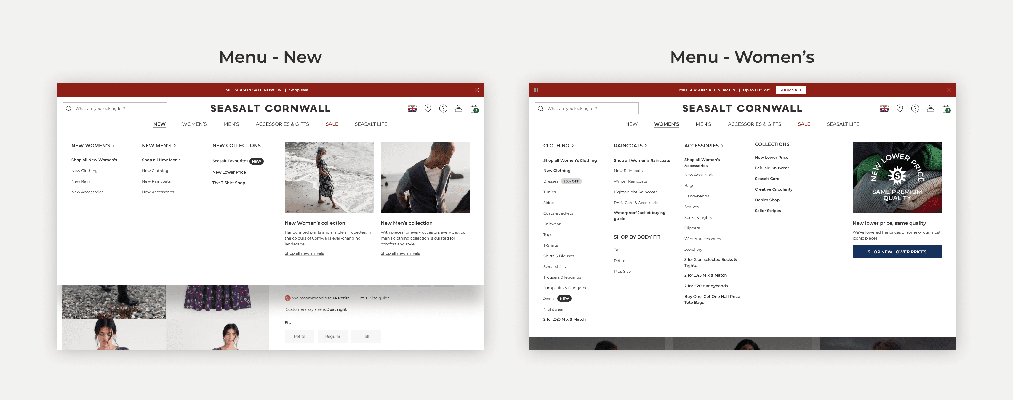
Redesigned MMAs to include additional text and links
Redesigned tags with additional labels (NEW, TRENDING, EXCLUSIVE)
Consistent layout and placement for every menu
Max-width content container so menus don't span the full browser on larger screens
Better scroll behaviour when a menu extends past the viewport
Animation on the selected menu item
Reduced colour palette for a cleaner UI
Sub-category arrows and animation indicating linked landing pages
Menu - mobile & tablet
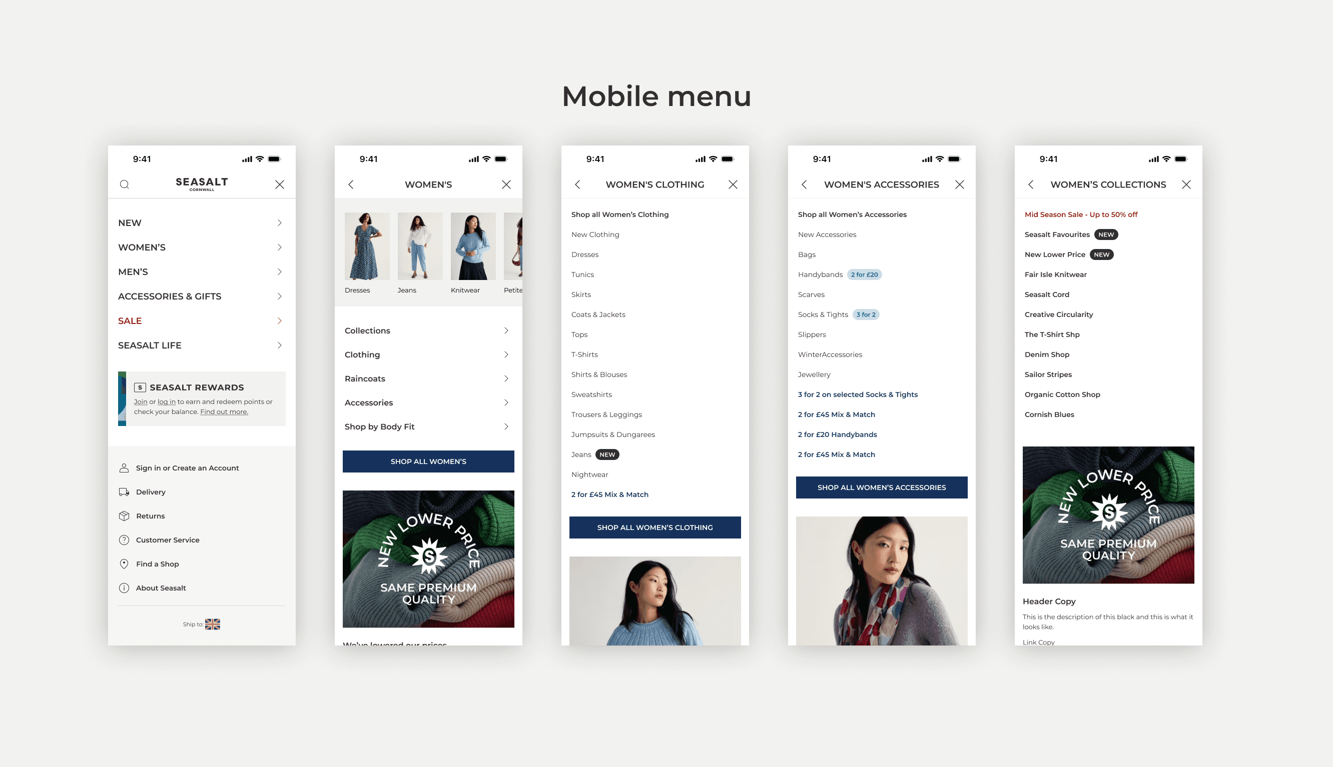
Rewards promo block prompting login/sign-up
Menu levels 2 and 3 open in a new frame rather than expanding/collapsing, for usability and cleaner design
Updated styling, font size, and colour palette, with icons added to links
Ability to add MMAs at category levels 1 and 2
Image category carousel on Women's, Men's, and Accessories
Menu Structure Changes
Alongside the design, I reviewed and updated the menu structure - a collaboration across UX, Trade, SEO, Copy, and Merch. Changes included:
Renamed categories for clarity: 'Tops' → 'Tops & T-Shirts'
Removed duplicated links (e.g. Women's T-Shirts appearing twice)
Removed very low-inventory categories and folded them into adjacent ones
Removed 'Shop by Fit'; moved Petite, Tall, and Plus into Women's Collections
Added 'New Collections' to the NEW menu
Split out Seasalt Life categories; added dedicated sections for Seasalt Rewards and Seasalt Stories
Results
I compared six weeks of Contentsquare data before and after the 28 April release.
The headline: raw engagement fell on both devices, but that's largely by design as the header now hides on scroll to free up screen space, so is not visible on screen as much as before. What matters more is what happened to the clicks that remained: conversion quality rose sharply across nearly every element.
Mobile menu: Conversion per click more than tripled post-release. Users are clicking the menu roughly twice per session now versus once before - fewer people opening it, but the ones who do are significantly more likely to buy. Note: overall mobile header click rate fell post-release, partly due to a known scroll bug currently being fixed.
Desktop header: Bag engagement nearly quadrupled. Account conversion per click more than doubled. Search conversion per click up 23%. Across the board, the clicks that remain are more purposeful and more likely to result in a purchase.
Find a Shop: Find a Shop clicks are up 51x versus when it was buried in the old account menu.
Need Help: Engagement up 29%.
Account: Log In clicks up significantly: +53% on desktop, +146% on tablet. The inline dropdown form is reducing the need to navigate to a separate login page, which is exactly the right outcome.
Menu categories: Sale engagement more than doubled on mobile. Women's and Accessories saw strong conversion gains. Men's dropped on both devices - flagged for investigation and already in the optimisation backlog.
The standout findings:
Create an Account has the highest purchase conversion rate per click of any auth element, despite low click-through - and its exposure above the fold improved significantly post-redesign. A high- converting element that was previously hidden. This is already feeding into the next iteration.
Find a shop & need help features had been removed in the previous brand redesign; reinstating them as first-class header elements had an immediate measurable impact.
Long-Term Value
Beyond the launch metrics, this gave the business a foundation built to last.
For the business: Trade and Content teams can now edit the menu without developer support. The layout scales responsively across tablet and small desktop. The Rewards infrastructure is ready for richer, status-based personalisation as that programme grows.
For the customer: a consistent, accessible experience on every device, a clearer category hierarchy, and a loyalty programme built to feel more personal over time.
Continual optimisation
There are currently 22 optimisations mapped across Menu, Header, Mini Bag, Account, and Search - a live backlog, not a closed project.
Live now: image category links in the menu · product recommendations in the menu · Rewards login prompt A/B test · Sale discount messaging · Seasalt Life description in menu · clickable logo · repositioned animated login prompt in header
In design: Reward points in the mobile menu · extra content in the mini bag · quick links to top categories in the menu
Queued: search bar within the menu · search bar placeholder wording · account icon animation · blog article feeds in the Seasalt Life menu
Find a Shop clicks vs. the old buried link
Need Help engagement
mobile menu conversion per click
Women’s category engagement, desktop
search conversion per click, desktop
account log-in clicks, desktop / tablet
View more work

E-Commerce | UX Design | User Research
Redesigning the Product Detail Page (PDP)
A mobile-first redesign that delivered a 24% uplift in conversion and reduced bounce rates by 12%
Community | UX | Information Architecture | User Research | Strategy
Transforming Fuse: A UX Optimisation of Seasalt’s Intranet
Improving usability and brand alignment to enhance the employee experience and drive engagement.
E-Commerce | UX Design | User Research | Prototyping | Strategy
Optimising Seasalt’s Navigation & IA
Revamping user experience through improved navigation and usability and driving 18% increase in page views to key product categories
Load More